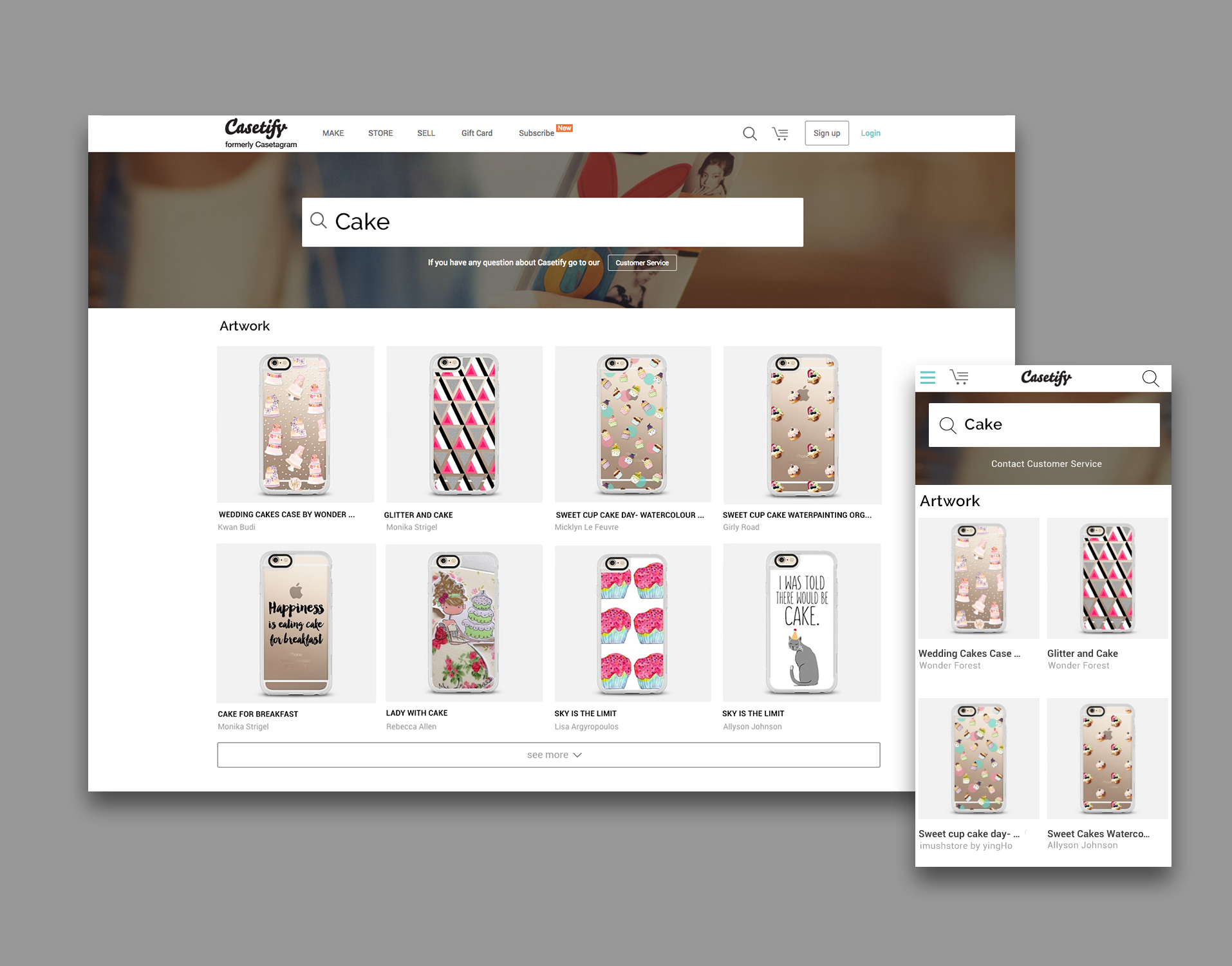
Casetify Search Feature Enhancement
Company: Casetify
Team
3
1 Designer, 1 Product Manager, 1 Developer
Role
UX Design
Duration
2015
Overview
I led the UX redesign of Casetify's search functionality across desktop and mobile platforms. Collaborating with the product team, we implemented an intuitive, responsive search interface that streamlines product discovery. This optimization resulted in enhanced user engagement and improved e-commerce conversion rates.
Problem
The previous search function was on a separate page, making it difficult for users to return to their previous browsing location. When using the old search function, users could only preview iPhone cases in the search results, which failed to showcase the diversity of Casetify's product range. With Casetify's extensive artwork database, search results often became lengthy, forcing users to scroll excessively to find artists, who were typically listed at the bottom of the page. On mobile devices, users were never able to reach the artist listings in the search results due to this layout issue.
The Objective for the Enhancement
Improve usability on the mobile site
Display more device types in search results
Enhance navigation ease
Enable comprehensive site-wide search functionality
Solution
To address navigation challenges, we revamped the search feature as a dropdown search bar. Users can now access the search function anywhere and anytime on the website. We also repurposed the five main categories from the Make/Custom page (iPhone, Apple Watch, iPad, MacBook, and Others) as search result filters. Users can filter and access artwork across these 5 categories using the same keyword.
We adjusted and fine-tuned the search feature algorithm. It now displays not only different artwork but also device types, artists, and collections that include the same keyword. These new search results appear at the top of the page, and we have replaced the "see more" option with pagination for artwork search results. Users now have a better experience browsing each section without endless scrolling.
On mobile devices, where screen space is limited and product display is prioritized, we integrated the search feature into the nav menu, maintaining accessibility on any page. After entering a keyword, users can still access artists and device sections in the search results, all located at the top of the screen. By swiping right, they can view more search results. However, as collection results occupied too much screen space, we limited their display. Users can still access collections through the nav menu.
Wireframe
Final Design

